
As you can see to the right are some of my initial designs I made for my site when I was first given the assignment. Figure 1 is an image of my first draft wireframe design of the home page. When compared to the final product the main structure of the page is fairly representative of my first ideas.
Figure 2 shows my Site Map. This shows how my individual pages are linked between each other.
In Figure 3 my design mock-up of the home page is shown, I decided to make the complete image of my site in illustrator. This is because the way HOTGLUE works it was recommended to me by a 3rd year Digital Media student to make each individual part as an image so that I could easily insert them into position in my page. See Portfolio Implementation and Intro to HOTGLUE pages for information related to how I implemented my design and why this was important.
I went for a clean and monochrome design for my page. I wanted my site to be modern and professional looking. I could have gone for a more light-hearted and colourful design which seems to be a more common theme when it comes to sites created with HOTGLUE but I wanted to represent myself in a different way to that.
I used a Sans-Serif font called Century Gothic. I chose this font because it's modern and simple, I also combined Bold and Regular weightings of this font to highlight certain words. I believe using this technique makes the type on my site more aesthetically pleasing.
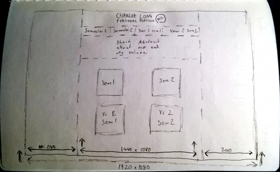
Figure 1
Figure 2
Figure 3
In this page of my portfolio I will talk about the design of my portfolio. How I came to the final design and layout, and why I chose to design my HOTGLUE personal portfolio in this way.